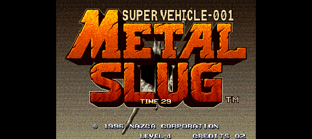
Metal Slug is a run and gun arcade shooter game released in 1996 by Nazca Corporation/SNK. It was also available on the Neo Geo and soon found its way to a bunch of other home gaming consoles. Metal Slug has been widely praised for its unique blend of running and vehicle based gameplay, which lead to a number of sequel titles and game spin-offs. But hands down the most iconic aspect of Metal Slug is the fantastic art.
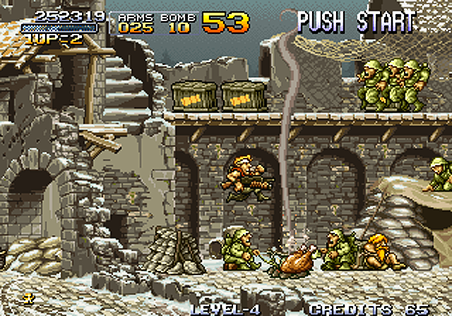
It doesn’t take long to appreciate the art of Metal Slug. It is noticeable as soon as you jump into the first level. The color palette of the game is relatively simple and somewhat limited. A heavy mix of greens and browns are dominant. But within these constraints the artists were able to bring each character, projectile and vehicle to life. Subtle environmental details like snow and grass can be found on ledges and platforms. The shading is also really good, adding another level of dimension to every graphical element on the screen. The detailed sprite work of Metal Slug is unmatched when placed next to other pixel art of the era (or any game since then for that matter).

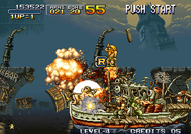
What really brings the art to life in Metal Slug are the animations. Many 2D games tend to simplify sprite frame counts for performance reasons. Less is more and all that. But not Metal Slug. Many of the enemy animations are well over 4-5 frames long. And the explosion animations follow suit. Blowing up even little stuff feels like an event with excessive plumes of fire, smoke and debris. The longer animations (when combined with the superb sprite work) add a certain flavor to the game. Everything that moves feels incredibly alive and responsive. There is a price to pay for these detailed animations though. The frame rate will sometimes take a hit as the action heats up. But who cares? Everything in the game looks glorious as it is blown to bits in slow motion too.

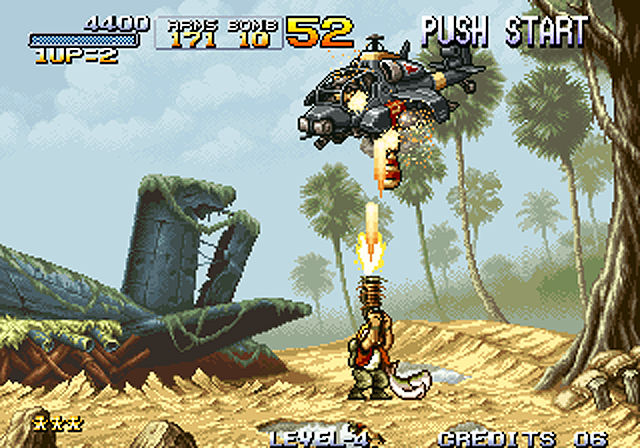
And last but not least, we have to talk about the background art. The backdrops of Metal Slug are visually striking, but never look overbearing. Faded backgrounds blend with the bold foreground objects, creating a nice sense of depth. What is most impressive is the artists didn’t have to use a bunch of layers to achieve this. In some levels there are only a couple of background layers. One layer is placed immediately behind foreground objects (buildings, trees, etc). Additional layers are then placed behind that layer (sky, mountains, etc). The result is a fascinating parallax effect that works seamlessly with the rest of the art.

Simply put, the art of Metal Slug is absolutely superb. The sprites, animations and backgrounds work together in perfect harmony. The result is an adored visual masterpiece that has the feel of an over-the-top 1980’s military flick. The Metal Slug franchise has been around for a long time, and the art direction has largely remained intact. Coincidence? We think not. They say perfection is impossible…but the art of Metal Slug is pretty close.
Hopefully you enjoyed our latest blog post. Let us know if you have any questions or comments. Sign up to our email list (below) for future updates. Thanks for reading!
Be sure to check out our latest game Martian Law on Steam (PC).

